Monday, 16 June 2014

Henry Moore at Perry Green (Visited 25 May 2014)

My partner and I spent a pleasant afternoon wandering around Henry Moore’s house and grounds in the village of Perry Green, which is about a 30 minute drive from where I live in Royston. Both are open to the public: we have visited before, but timed our visit this time to coincide with an exhibition of the work of other artists and sculptors who have been influenced by Moore. Damien Hirst’s “pickled cows” were on display and it was interesting to note that at one point in his career Moore and his work were criticised and lampooned by other artists who felt that he was the “golden boy” of the establishment and that others were not getting a “look in”.


I always take a camera on these visits and try to look for novel subjects for the lens. Obviously just photographing Moore’s sculptures is of little value, so I looked to investigate the “inner space” of his works, concentrating on shape, pattern, colour and texture. I liked and kept half a dozen of the resultant images. One in particular caught my eye (Image): the combination of ovals and angles, the texture of the bronze and the variety of colour (slightly enhanced in post-production) were aesthetically appealing. I entered an A4 mounted print of the image into Royston Photographic Society’s 2014 “Open Print” competition on 12 June 2014. Much to my surprise, it received top marks and won the certificate for the judge’s favourite print of the competition (out of 55 entered)!

Image

How valid as a work of art is a photograph of a work of art? I enjoy this image purely as an abstract, just as I would an abstract created by focussing on a detail of a piece of engineering, such as a bridge or a clock mechanism, or focussing on a detail created by nature, such as ripples in the sand or rock strata. Sometimes man and nature combine (reflections of light on a canal spring to mind) to give the photographer the opportunity to create their abstract: in my view, all are equally valid.

Andreas Gursky at the White Cube

Andreas Gursky (b 1955) is known for his huge, interior and exterior landscape photographic works, which are incredibly rich in detail. The photographs, often taken from an elevated viewpoint, are taken with a large format camera. His works sell at auction for huge, record-breaking amounts of money. The White Cube exhibition, his first in London since 2007, features some of his more recent works including the very recent (2013-14) “Super Hero” works and “Lehmbruck I and II”, that have not to my knowledge been exhibited before.

The White Cube is an excellent venue for exhibiting Gursky’s work. The large rooms, plain white walls and functional design of the gallery space compliment the huge (up to 2.5 x 5 metre) framed prints and allow the visitor plenty of opportunity to contemplate the incredible detail in the works.


Viewing Gursky’s art at close quarters enables the visitor to appreciate just what it is that excites dealers and collectors to pay huge amounts of money for his works. Prints such as “Kirchentag” and “May Day IV”, which depict mass festival gatherings in Germany, depict ant-like figures within a huge crowd, enabling the viewer to study both the connections between individuals and the way in which they integrate to produce crowd activity. In contrast, “Lehmbruck I” and “Lehmbruck II” create tension by presenting a conundrum in the form of the distinctive architecture of this Duisburg museum, used as a setting for a selection of iconic works of art together with an apparent audience of a small number of carefully placed figures (see below). I imagine that a huge amount of time and effort must have gone into post-production in order to finish these works, but I found it hard to tear my eyes away from them and move on; a pointer to their efficacy, at least for this spectator.

Andreas Gursky: "Lehmbruck I"

Also on display for the first time is a new series of images inspired by Hollywood comic-book heroes, such as Spider-Man, in which the heroes are placed in idealised landscapes. These works have provoked a little copyright controversy (which will doubtless renew the phrase that “there is no such thing as bad publicity”, although I found this section of the exhibition less thought-provoking than others.

Two of the reflections of neon lights on the waters of the Chao Phraya River from Gursky’s “Bangkok” series are featured here. I have the book, but looking at the huge prints on the walls is an altogether more satisfying experience than thumbing through them in the book. The beautiful abstract, colourful shapes and patterns caused by the effects of the neon lights on the swirling waters are really effective and the individual items of human debris being carried downriver all add to the overall pattern (In my own work with reflections on canals and slow-moving water, such items are usually removed in post-production: I wonder whether, in Gursky’s images, some items of debris have actually been added in post-production to give the images more balance….).

I really enjoy looking at works of art that challenge the viewer to interpret their meaning so “Lager”, which incorporates parts of some of his other works within a very three dimensional, architectural setting, was a firm favourite.

Viewing Gursky’s full sized photographic prints enabled me to appreciate just why he has become so popular amongst rich collectors of fine art. The scale, the incredible detail afforded by the use of a large format camera, the clever choice of subject matter and the (doubtless) huge amount of post-production work that went into the assembly of each work on display here all lead to the production of objects that both have an immediate impact, are aesthetically appealing and will constantly reveal more with each viewing. Although there is a consistent style to his work, the variety of Gursky’s subject matter is impressive.

Learning Points, Future Work and References
Many of Gursky’s works challenge the viewer to interpret their meaning, but all can be enjoyed as aesthetically appealing works of art. Presenting the viewer with an image (or series of images) that presents a visual conundrum or encourages them to create their own story from the image(s) creates tension and must add value to the art. This will be particularly relevant to my own major project work and I should look to create tension within the story board. Whilst it is not possible to know how much digital manipulation was applied to each of Gursky’s images, some of these works clearly exemplify how the sophisticated tailoring of post-production techniques can produce an aesthetically appealing effect. On an inevitably simpler scale, I could (and occasionally do) apply similar techniques to my own work.


Wednesday, 4 June 2014

Project 9: Change. Studies of Leaf Decay

Project 9: Change. Studies of Leaf Decay.

Shortly after receiving the notes for the current course in September 2013 I decided to initiate a personal project, looking at leaf decay. The intention was to study the decay, over weeks, of fallen leaves. I was particularly interested in looking for colour changes caused by the chemical degradation of the chlorophyll porphyrins that give the leaves their colour and in comparing the degradation of leaves from different species of tree. I planned to photograph the leaves at regular intervals and to use the photographs to produce composite images, tracking the progress of the decay. Although I set myself a number of goals, one goal was to produce and present a sequence of images for Project 9 (“Change”) of the course work.

Following the telephone discussion with my tutor, held in December 2013, it was agreed that all my course project work for Assignments 1 and 2 should be geared to complimenting and benefiting the study for my major project (“Feeding The Birds”). Consequently, the leaf decay studies were considered unsuitable. However, the work was not abandoned and I have included an overview of the studies to date here, as part of my logbook/blog.

 Methodology
Freshly fallen leaves were collected between late October and early November. Leaves from a wide variety of tree species were chosen. The main criteria for collection were that (a) the collected leaves should be colourful, with at least three different colours (including green) being visible at the start and (b) they should incorporate distinctive forms, patterns and/or defects that could be studied as the leaves decayed.

The leaves were photographed on the day of collection. They were then left outdoors, at the mercy of the elements, to “weather”. The leaves were then re-photographed every 2-4 days until no significant changes could be seen between the final two images. Photography was carried out by placing the individual leaves on a light box, after the leaves were first dampened (if necessary) and then flattened inside a heavy book. All leaves were placed diagonally across the light box, with the stem at the bottom right. Care was taken to ensure that the leaves were always the right way up! The camera (always the Nikon D90 for this project) was adjusted manually, with the 17-70mm zoom lens set to ca 35mm, the shutter speed between 1/40 and 1/60 seconds and the aperture in the range f8 to f11 (as leaves darkened it was necessary to use longer shutter speeds and/or wider apertures).

I started photographing 15 leaves, but only ended with seven. Some of the leaves, despite being pinned down outside by bricks and stones, blew away in the storm force winds of the “St Jude’s Storm”. Other leaves produced uninteresting results, so these were discarded.

Post-production work involved selecting (say) five from up to 12 images of an individual leaf, which together clearly showed the progress of decay. Each image was then cropped in a horizontal (7x5) format, using “Photoshop Elements 8”. Blemishes on the surface of the light box were removed and the five images were roughly “equalised” for light box brightness. Images were reduced to a standard size, care being taken to ensure that the size of the leaf in each image was essentially the same. Minor changes were made to leaf brightness and contrast. The leaf in each image was then selected and copied onto a plain white background. The leaf was rotated into a vertical position (stem at the bottom). The resultant image was then cropped closely to each side of the leaf, the cropped image (now in “portrait” orientation) being adjusted to a standard height. Finally, the leaves in each of the five images were again selected and copied onto a “letterbox” shaped plain white background and moved so that the first photograph of the leaf was on the left and the last photograph was on the right, with the leaves in date sequence and similar gaps between each two leaves. The progress of decay could then be studied by moving sequentially from left to right.

The composite images for oak leaf (Image 1), maple leaf (Image 2) and beech leaf (Image 3) decay are shown below.

Image 1: Oak Leaf Decay


Image 2: Maple Leaf Decay

Image 3: Beech Leaf Decay

I decided to have Images 1 and 3 printed commercially at (20x8) inch size. The prints reveal more clearly the subtle effects of decay moving from the left to the right of each sequence. However, they also demonstrate that the beautiful changes in colour experienced when leaves “turn” in the autumn whilst still attached to the trees (particularly noticeable in Japanese Maple) cannot be reproduced once the leaf has fallen; rather, the leaves just darken and turn brown as the tree that has nurtured them can no longer provide any sustenance.

Further Work
From collecting the leaves to producing the photographs and converting them into composite images, this project has consumed a considerable amount of time (only a fraction of the work is presented here). However, the project is unfinished. I have presented the results of leaf decay in a formal, figurative manner. Although this is an effective way of illustrating how an individual leaf decays I would like to go further by producing a composite for leaf decay in general, in which the destinies of all the leaves involved in my study are interwoven. When (if ever!) there is time I have an idea in my head about how to put across the concept of (fallen) leaf decay, using images of all the leaves that I studied, in a more abstract and artistic manner….. watch this space.


Assignment 2 Project 3: Modification of a High Key Image

In general, my tutor’s feedback regarding the two high key and two low key images of birds that I had submitted for Project 3 of my second assignment was positive. The most dynamic image of the set was a high key study of juvenile whooper swans landing (Image 1 below; presented here with a narrow black border). Whilst I was generally happy with the outcome of my post-production work I was a little unhappy with the ordering of the swans: the one in the middle, which is already skimming the surface of the water with its feet, should really be “leading the way” at the front! Also, despite the “letterbox” cropping, the photograph does not give the birds quite enough space to move into.

Image 1

My tutor pointed out that, with such a simple background, it would have been fairly easy to re-position the swans in the required order. The only issue that I have with this is that I like to record natural events as truthfully as possible and, although I am not averse to removing distracting objects that do not affect the natural history story presented in the image, changing the order of the birds is not something I would consider if I was presenting this image in competition or using it for commercial purposes. However, since neither of these considerations applies here…….

The image was edited in “Photoshop Elements 8”, using the Clone Stamp tool to remove the left hand swan and then to replace it by moving the central swan over to the left hand side of the image. The resultant image (featuring two swans, with a large central gap between them) was saved. The first image was re-opened. This time the central swan was removed using the Clone Stamp tool and the left hand swan was moved into the centre of the frame. The resultant image was pasted over the first modified image to create a separate (top) layer. The section to the left of the (new) central swan was erased to reveal the “skimming” swan and the resultant image was flattened. Finally, the few strands of remaining vegetation (top right of Image 1) were erased to give a cleaner image (Image 2), featuring the new, improved line-up of swans.

Image 2

Finally, I made two further modifications. Firstly I slightly extended the background to the left of the swans, to give them more space to fly/swim into, cropping off an equivalent area on the right of the image. Then, I reversed the image horizontally so that the action was taking place from left to right. This is the direction that my gaze naturally tends to follow when I am “reading” an image, perhaps because I also read from left to right, and produces what for me is a more natural looking image. The whole process, from starting with the original image to producing the final image (Image 3), took just 20 minutes.

Image 3

Conclusions and Key Learning Points
Whilst Image 3 is “manufactured” it does provide a fluent, ordered illustration of some of the stages of swans landing and reads smoothly as a simple “action” story as the eye moves from left to right. The resultant sequence is now more aesthetically pleasing, although it could be argued that it loses some of the tension of the original.

Learning Points:
·         When a “good” image has been produced it is worthwhile thinking about whether and, if so, how it can be made even better during post-production.

·         High key images offer more potential for modification of the type shown above than do those images that have been produced and/or processed using a standard exposure.

·   In creatively modifying an image in post-production, the balances between aesthetics, tension and photographic truth are critical considerations.


Alternatives for Project 8: "The Decisive Moment" (2). "Avocet Behaviour"

Project 8 “The Decisive Moment”. Non-assignment Images (2): “Avocet Behaviour” (28 March 2014)

I paid a visit to RSPB Titchwell nature reserve in Norfolk in order to photograph the many wading birds that use the reserve. Avocets were feeding in the mud and water beneath the bank upon which I was standing. The avocet is a wading bird with an unusual, up-curved bill that it swishes from side to side in order to feed on invertebrates in the mud. The following sequence of images was taken over a ten minute period.

I was using my Nikon D7000 camera, equipped with 300mm Nikon f4 lens and 1.4x converter, in order to get close to the birds that I was studying. The weather was overcast, but bright. I noticed that one avocet was leaving a trail of footprints in the mud as it moved about: I took a few images of this bird, together with the trail of footprints (Image 1; cropped to concentrate on the bird’s features). The bird started feeding whilst still on the mud, moving its bill from side to side. Normally the bird feeds in the water, where the tip of the bill cannot be seen, so I tried to take some photographs that demonstrated its mode of feeding: Image 2 was my favourite from this sequence. I was about to move on when I noticed a second, female avocet in the water nearby, having developed a “submissive” pose (Image 3). I realised that the birds were likely to mate, so moved along the bank to a position from which I hoped to get a better view. The second bird approached, until it was next to the female (Image 4). As expected, the birds mated. Unfortunately, the birds turned slightly away from me and I was unable to get a side-on or frontal view of the event. I took several photos of the brief event, of which Image 5 was a typical example, before the male dismounted (Image 6) and the birds moved away. The whole mating event had taken under one minute.

The Decisive Moment
Feeding and reproduction, together with migration, finding shelter and avoiding predation, summarise the basic requirements for birds and many other animals. This short sequence of events concentrates on the first two. Image 2, which highlights the avocets’ unusual method of feeding, and Image 4, in which both parties acknowledge that mating will take place, clearly show decisive moments in the birds’ lives. The latter photograph is my favourite, because it demonstrates an important interaction between the birds and can, with a little knowledge, be clearly interpreted. However, the photographs of the mating process and its aftermath were unsatisfactory, because I did not have and could not gain eye contact with both birds. For this reason I considered the sequence, which I had not planned for, not to be suitable for submission for Assignment 2, Project 8
.
The camera and lens combination generally worked well although, because I was using a fast shutter speed to capture the action, the aperture was not sufficiently narrow to ensure that details of the birds’ plumage were always sharp.

The sequence from Image 1 to Image 6 is another example of a picture story, in which a sequence of events is illustrated without the need for captions. It is therefore useful preparation for the Major Project. The image sequence is shown below.

Image 1

Image 2

Image 3

Image 4

Image 5

Image 6


Alternatives For Project 8: "The Decisive Moment" (1). "The Fish Thief"

Project 8 “The Decisive Moment”. Non-assignment Images (1): “The Fish Thief” (24 March 2014)

In my search for a set of images for Project 8: “The Decisive Moment” (Assignment 2) I investigated many situations, which I hoped would provide me with a suitable story. In March 2014 I paid my first visit for three years to London Zoo. One of the many reasons for the visit was to photograph the wild herons that nest close to the zoo in Regents Park and regularly visit the zoo in order to take advantage of the hand-outs of food for the flamingos, pelicans and penguins. Whether you love or hate herons, they are undeniably birds with character. I noticed that one particular individual was loitering in the penguins’ enclosure and that the penguins were due to be fed an hour or so later.

When I returned I arranged to sit at the back of the small outdoor auditorium, where I had an unrestricted view of events as they unfolded. I used my Nikon D7000 camera with 70-300mm Nikon Lens, using a fast (1/1000s) shutter speed at a fairly high ISO (ISO 800; necessary to avoid under-exposure). Once the tannoy announcements started and a keeper appeared with a bucket of dead fish, the heron flew across the enclosure and landed on top of the screen that separated the penguins’ pool from the audience (Image 1), where it perched precariously (Image 2). Once the keeper started to feed the penguins (Image 3) the heron leaned forward, watching the water attentively (Image 4). At regular intervals it would jump off the screen and land in the water, where it would splash about and try, with limited success, to take one of the fish (Image 5). If successful, the heron would fly to the side of the pool (Image 6), where the fish would be consumed (Image 7). This process was repeated several times, allowing me to capture the various stages of the cycle…..except for the one where the heron succeeds in catching a fish! The sequence of images shown on the next page is therefore not in time order and Image 5 shows a failed attempt to catch a fish. The penguins were more successful, but then they are capable underwater swimmers and, in any case, the fish was intended for them!

Whilst I was photographing the heron two herring gulls were also trying to catch the fish. Because herring gulls are the subject of another project (“An Impartial View”) I was keen to photograph them also, which led to some distractions.

The Decisive Moment
In my mind, the “Decisive Moment” was always going to be the capture of a fish by the heron in the water. Unfortunately, when I came to post production I found that I did not have any satisfactory images of this event. Furthermore, the best shot of the heron flying to the edge of the pool with a fish was a little blurred (Image 6), so I decided not to use this event for Project 8. Nevertheless, I edited the images and used seven in order to put the sequence of events together to create a picture story; this should provide useful experience for creating a story board for the Major Project, where the sequence of images should tell a story without the need for words. Furthermore, I may use the sequence as my entry for the next Royston Photographic Society “Storyboard” competition, later this year.


The picture story (Images 1 to 7) is shown below.

Image 1

Image 2

Image 3

Image 4

Image 5

Image 6

Image 7


Project 1: Gestalt. Examples Unrelated to Major Project Work.

Introduction

The first assignment required me to produce three images in which I consciously made use of one or more of the Gestalt laws, as outlined on pages 24-25 of the course notes. I decided at an early stage to start collecting images that made use of these laws, both when confronted with a photographic opportunity and also by doing some studio work. Since I often make use of one or more of these laws when composing my photographs I did not expect to have too much difficulty in finding examples of Gestalt on location. I also went out of my way to look for some “extreme” examples of Gestalt in action. I discovered that I often use the Law of Good Continuation in my photography and came across many examples of this. The Law of Simplicity could be observed in photographs of the folds and curves of the agricultural fields near my home in Royston (see work for Assignment 1). I purchased a set of dominoes and did a little studio work with these: I was investigating combining two or more of the Gestalt Laws in the studio when, in December 2013, I had a tutorial by telephone with my tutor, in which he strongly recommended that for Assignment 1 I should find, photograph and submit examples of the Gestalt laws that were of relevance to my major project. I therefore changed course: here I present a handful of examples of my earlier work, which are not of relevance to the major project and were therefore excluded from consideration for assignment work.

The Laws of Gestalt
In the course notes the laws are given as follows:

Law of Proximity: Elements are seen in groupings according to how close they are to each other.

Law of Similarity: Elements that are similar in some way, by form or content, tend to be grouped.

Law of Closure: Elements roughly arranged together are seen to complete an outline shape. The mind seeks completeness.

Law of Simplicity: Simple lines, curves and shapes are preferred to complex ones.

Law of Common Fate: Grouped elements are assumed to move together and behave as one.

Law of Good Continuation: The mind’s eye likes to continue shapes and lines beyond their ending points.

A search of the internet revealed that the laws (or “principles”, as they are more commonly referred to) do vary somewhat. In particular, the concept of “Simplicity” is sometimes replaced by “Figure – Ground”, which refers to the relationship between the subject(s) of the photograph and the surroundings. However, all the examples described below relate to the concept of “Good Continuation”, although other concepts were also incorporated.

Studio Work

I used a set of dominoes to look at ways of attempting to demonstrate some of the principles of Gestalt. In the example below (Image 1), the seven “doubles” dominoes were placed in receding order, with the double six at the front and the double zero at the back. There is no overlap between the dominoes, so the numbers on the central five dominoes are clear (the camera, which was tripod-mounted, was focused on the double four). Because of the nature of the set-up depth of field was limited, so the dominoes at the front and back are in “soft focus”, but the spots can clearly be seen. Sections of the front (double six) and back (double zero) dominoes were deliberately excluded from the initial photograph and the percentage visible areas of these dominoes were further reduced by cropping. My idea was that the viewer can, by identifying that the dominoes are in order, complete and visualise the missing sections of these dominoes in order to affect Closure. The image is also an example of Good Continuation.

Image 1

Location Work
The photograph below (Image 2)of the steps leading from the promenade to the beach between Hunstanton and Heacham in Norfolk is, perhaps, an extreme example of Good Continuation. The steps actually form a gentle curve and, given the limited subject matter in the image, this image might also be regarded as an example of Simplicity. The railings in the foreground provide a start point, from where the steps lead us to the couple walking towards the camera and beyond to some very distant objects. I took several photographs at this location, including some with people in the foreground and the railings in the background and people walking both towards and away from the camera: all were valid examples of Good Continuation.

Image 2

Another example of Good Continuation can be seen in an image of the Christmas 2013 “Santa Run” in London’s Battersea Park (Image 3).

Image 3

The line of running Santas leads back to the right hand edge of the image and is complimented by the line of London Plane trees and (where visible) the “matching” traffic cones. The closest runner is about to “high five” a steward who is almost entirely out of the picture on the left. Visualisation of the steward might be considered an example of Closure, whilst the Santas approaching the camera demonstrate the concept of Common Fate. The effects would have been clearer if I had been able to take my photograph from an elevated position (not available).

The musicians playing in a London street (Image 4)  also provide an example of Good Continuation, as the eye is led along the wall and pavement of the street to two people and a dog in the background. The single yellow line accentuates this effect, although it is not as clear as in the other examples.

Image 4

The positioning of the rucksacks in this image is unfortunate, but could not be avoided. Do the six people in the photograph fall into two groups (the musicians and the ladies with the dog) or three (in which the drummer is considered on his own)? Either way, this photograph exploits the law of Common Fate.

The final image (Image 5), taken in the Yorkshire Dales, is another simple example of Good Continuation, with the dry stone wall and adjacent path leading the viewer’s eye through the frame, to the rocks beyond.

Image 5

The stile in the foreground provides an initial focal point. Ideally, I would have liked to feature a group of walkers in the middle distance, walking away from the camera, but none were available at the time.

The examples illustrated above demonstrate that I have a natural tendency to look for lines of Good Continuation in my photographic work, but am more constrained in my use of the other Gestalt laws. This implies that perhaps I rely too heavily on a limited selection of principles when composing my images.


Tutor Feedback on Project 8 (Assignment 2)

Project 8: “The Decisive Moment”: Tutor Feedback

Here, for once, praise for the quality of the images (The quality of these images jumps off the page or screen. This was like looking at work of a completely different calibre than that previously seen and I feel these images are of a professional quality and you should be very pleased and proud of them) and there were no technical issues: clearly the use of the 300mm prime lens with converter (the combination was used for all the images in this project) has had a pronounced effect! My main issue now is how to get the best out of my other lenses, because there is no way that I will be able to use the prime lens for all my work!

Unfortunately there was a problem with my interpretation of the project, however: the downside is the decisive moment. This is not strong at all in these images. I think you need to look at this again in terms of how does the decisive moment affect the rest of the image – the other people /birds things etc. in the image. Having the bird alone just doesn’t deliver that. It therefore appears that my view of the most decisive moment in the sequence of images of the bird visiting the feeding station as being when the nuthatch has the peanut in its bill (or possibly when it picks up the nut) is wide of the mark. This isn’t a decisive moment at all: instead: in bird terms it’s that stealing food from another moment – or escaping from a predator etc. Unfortunately I didn’t capture any images of birds escaping (or being caught by) predators whilst I was searching for decisive moments: if I had, it’s unlikely that I would have been able to capture a sequence of six (or even two!) satisfactory images. My tutor kindly gave me a reference to a video clip of Cartier-Bresson discussing his interpretation of “The Decisive Moment”, which helped somewhat in my understanding of this phrase.

During my work leading up to the submission of Assignment 2 I captured a couple of other sequences featuring birds that I considered using for this project: these are discussed in other posts for Project 8. I would be interested to know whether any images from either sequence could clearly be described as representing “The Decisive Moment”.


To end on a positive note, my tutor commented that I think this has been a very good project for you in terms of development and comprehending the differences that your equipment is capable of. It must have been quite a revelation here in terms of the difference between a zoom and the prime especially when it came to printing and your technique and work flow etc. have developed well on this project.

Tutor Feedback on Project 5 (Assignment 2)

Project 5: “An Impartial View”: Tutor Feedback

My tutor commented that You demonstrate a competent realisation of your ideas in a well presented and well-judged manner. I like the editorial approach to this work which came across quite strongly. This is though different to documentary and you need to investigate those differences. Also: I very much like the approach you took to the workflow of producing the story and the story gives an effective grasp on the ideas to be communicated – without reading the text. This is important as a photographer knowing that the majority is communicated visually. However, he reminded me that I should be working in the natural history and documentary genres for the major project and the composite image (Image 4 of the set), whilst interesting and “different”, was editorial.


Commenting on the four individual images presented for the text free picture story he again pointed out technical flaws or suggested improvements in composition that have been noted. He felt that the pier was too dominant in the opening picture, which was attended to link the gull with the seaside (see Image, below). The image of the gull eating the crab was not quite sharp (probably at least partly because this was actually a heavily cropped image, to concentrate on the “business end” of the story: I’ll not be able to do this when I’m working on the major project!) and it was suggested that I should “feather the edges” of the cut-out sections to improve the appearance of the composite image.

Image

My tutor was complimentary regarding my presentation of the four page “magazine” picture story, which I have to say required quite a lot of work to put together and, within the strict remit of the project, was probably not necessary! Comments included: I think you have made a really good effort here. You have a good balance and layout of images throughout the pages. There is good visual weighting on page 1 between image and text that makes it look quite genuine and the second page has a good wildlife feel about it. It shows natural behaviours that are fascinating and insightful for the viewer. The ledge image and the dropping image both show more facets of the wild gull and look to be well seen and captured. Good balance again visually well done. Page 3 is a good contrast of marauding mobs and the ubiquitous chip! ……. the posters ……. make a good end to the story.

Tutor Feedback on Project 3 (Assignment 2)

Project 3: “Experiments in Key”: Tutor Feedback

You seem to have investigated this topic area quite well. There are some good project based images here that evidence the nature and level of your understanding. The work undertaken demonstrates that you have the appropriate levels of technique and application to utilise these “key” elements where you wish to in future projects. There is a competent realisation of your ideas that are well printed and presented.

Comment on the individual images:

High Key 1: Swans landing. The sequential nature of the image is indeed broken but there are a lot more elements to this image in terms of key that make it worthwhile. You are shooting into the light and the shadow areas still have good tone. He commented that, given the high key nature of the image, it would be relatively easy to alter the sequence of swans using “Photoshop”. I have investigated this: see my separate post.

High Key 2: Herring Gulls. He felt that the image would have looked better with a square crop and that it was not sharp. I suspect that the lack of sharpness may have been partly due to loss of detail in the birds’ plumage during the conversion to high key, but I need to keep a close eye on getting my subjects completely in focus, because the issue of “lack of sharpness” has been raised elsewhere.

Low Key 1: Great Crested Grebe. My tutor commented that it’s a good image, I like it and the water on the back is nice and crisp. However, he noted also that at this level perhaps it’s a little safe – perhaps too safe you need to be doing a little more rather than such a simple image showing low key. To develop yourself you need to strive for the type of excitement – or mystery etc. that high or low key can deliver. I have taken this point on board: some of my other images that were not selected for the assignment were action shots with more excitement, but I was unhappy with their composition or there were technical flaws. However, in retrospect perhaps I should have replaced the “safer” images with these.


Low Key 2: Mute Swan. There were similar comments here as for the other low key image. However, in addition my tutor commented on lack of detail in the bird’s plumage. I have studied the print closely and struggle to find areas of plumage that are not sharp. However, despite this being a low key image some of the plumage is rather bright, so perhaps this is a case of too much contrast and some “blown” highlights. Either way, I clearly need to put extra effort into ensuring that my images are sharp when they need to be. It is, however, reassuring to note that this is a successful set that shows the required lighting, contrast and brightness used in a suitable aesthetic manner.

Assignment 2 Post 4 Tutor Feedback

Assignment 2: Tutor Feedback

The feedback was generally positive (You have documented the submitted work quite well and supplied three sets of images that show in the main that some good progress is being made on the course). However, issues remained concerning the technical quality of some of the images and there was also an issue regarding my interpretation of the “Decisive Moment” in Project 8. There was also some criticism of my logbook. The feedback on individual projects and logbook is discussed below.

Project 3: “Experiments in Key”
You seem to have investigated this topic area quite well. There are some good project based images here that evidence the nature and level of your understanding. The work undertaken demonstrates that you have the appropriate levels of technique and application to utilise these “key” elements where you wish to in future projects. There is a competent realisation of your ideas that are well printed and presented.

Comment on the individual images:

High Key 1: Swans landing. The sequential nature of the image is indeed broken but there are a lot more elements to this image in terms of key that make it worthwhile. You are shooting into the light and the shadow areas still have good tone. He commented that, given the high key nature of the image, it would be relatively easy to alter the sequence of swans using “Photoshop”. I have investigated this: see my separate post.

High Key 2: Herring Gulls. He felt that the image would have looked better with a square crop and that it was not sharp. I suspect that the lack of sharpness may have been partly due to loss of detail in the birds’ plumage during the conversion to high key, but I need to keep a close eye on getting my subjects completely in focus, because the issue of “lack of sharpness” has been raised elsewhere.

Low Key 1: Great Crested Grebe. My tutor commented that it’s a good image, I like it and the water on the back is nice and crisp. However, he noted also that at this level perhaps it’s a little safe – perhaps too safe you need to be doing a little more rather than such a simple image showing low key. To develop yourself you need to strive for the type of excitement – or mystery etc. that high or low key can deliver. I have taken this point on board: some of my other images that were not selected for the assignment were action shots with more excitement, but I was unhappy with their composition or there were technical flaws. However, in retrospect perhaps I should have replaced the “safer” images with these.


Low Key 2: Mute Swan. There were similar comments here as for the other low key image. However, in addition my tutor commented on lack of detail in the bird’s plumage. I have studied the print closely and struggle to find areas of plumage that are not sharp. However, despite this being a low key image some of the plumage is rather bright, so perhaps this is a case of too much contrast and some “blown” highlights. Either way, I clearly need to put extra effort into ensuring that my images are sharp when they need to be. It is, however, reassuring to note that this is a successful set that shows the required lighting, contrast and brightness used in a suitable aesthetic manner.

Project 5: “An Impartial View”

My tutor commented that You demonstrate a competent realisation of your ideas in a well presented and well-judged manner. I like the editorial approach to this work which came across quite strongly. This is though different to documentary and you need to investigate those differences. Also: I very much like the approach you took to the workflow of producing the story and the story gives an effective grasp on the ideas to be communicated – without reading the text. This is important as a photographer knowing that the majority is communicated visually. However, he reminded me that I should be working in the natural history and documentary genres for the major project and the composite image (Image 4 of the set), whilst interesting and “different”, was editorial.

Commenting on the four individual images presented for the text free picture story he again pointed out technical flaws or suggested improvements in composition that have been noted. He felt that the pier was too dominant in the opening picture, which was attended to link the gull with the seaside (Image: see below). The image of the gull eating the crab was not quite sharp (probably at least partly because this was actually a heavily cropped image, to concentrate on the “business end” of the story: I’ll not be able to do this when I’m working on the major project!) and it was suggested that I should “feather the edges” of the cut-out sections to improve the appearance of the composite image.

Image

My tutor was complimentary regarding my presentation of the four page “magazine” picture story, which I have to say required quite a lot of work to put together and, within the strict remit of the project, was probably not necessary! Comments included: I think you have made a really good effort here. You have a good balance and layout of images throughout the pages. There is good visual weighting on page 1 between image and text that makes it look quite genuine and the second page has a good wildlife feel about it. It shows natural behaviours that are fascinating and insightful for the viewer. The ledge image and the dropping image both show more facets of the wild gull and look to be well seen and captured. Good balance again visually well done. Page 3 is a good contrast of marauding mobs and the ubiquitous chip! ……. the posters ……. make a good end to the story.

Project 8: “The Decisive Moment”
Here, for once, praise for the quality of the images (The quality of these images jumps off the page or screen. This was like looking at work of a completely different calibre than that previously seen and I feel these images are of a professional quality and you should be very pleased and proud of them) and there were no technical issues: clearly the use of the 300mm prime lens with 1.4x converter (the combination was used for all the images in this project) has had a pronounced effect! My main issue now is how to get the best out of my other lenses, because there is no way that I will be able to use the prime lens for all my work!

Unfortunately there was a problem with my interpretation of the project, however: the downside is the decisive moment. This is not strong at all in these images. I think you need to look at this again in terms of how does the decisive moment affect the rest of the image – the other people /birds things etc. in the image. Having the bird alone just doesn’t deliver that. It therefore appears that my view of the most decisive moment in the sequence of images of the bird visiting the feeding station as being when the nuthatch has the peanut in its bill (or possibly when it picks up the nut) is wide of the mark. This isn’t a decisive moment at all: instead: in bird terms it’s that stealing food from another moment – or escaping from a predator etc. Unfortunately I didn’t capture any images of birds escaping (or being caught by) predators whilst I was searching for decisive moments: if I had, it’s unlikely that I would have been able to capture a sequence of six (or even two!) satisfactory images. My tutor kindly gave me a link to a video clip of Cartier-Bresson discussing his interpretation of “The Decisive Moment”, which helped somewhat in my understanding of this phrase.

During my work leading up to the submission of Assignment 2 I captured a couple of other sequences featuring birds that I considered using for this project: these are discussed in other posts for Project 8 (links here and here). I would be interested to know whether any images from either sequence could clearly be described as representing “The Decisive Moment”.

To end on a positive note, my tutor commented that I think this has been a very good project for you in terms of development and comprehending the differences that your equipment is capable of. It must have been quite a revelation here in terms of the difference between a zoom and the prime especially when it came to printing and your technique and work flow etc. have developed well on this project.

Logbook
The logbook as a Word/PDF document was getting quite bulky by the end of the second assignment: it was also becoming difficult to cross reference within the logbook (I had not inserted any links) and the splitting of the logbook into three sections (“Exhibition Visits”, “Projects not Submitted for Assessment” and “General”) was not working. It was also recommended that I should write up what I, as an individual, took from the exhibitions, how it would affect my practice, what I learnt, what I would experiment with etc. etc. As a consequence I have both overhauled my logbook and (as suggested by my tutor on more than one occasion) started this blog, which was activated on 2 June 2014 and now includes, under appropriate labels, all the articles that are in my logbook, in addition to assessment work and tutor comments. The process has taken about 60 hours during three and a half weeks in May and June 2014. The blog will be maintained as a publicly accessible logbook which I hope will be used by assessors for examination. However, I will continue to maintain the logbook both as a hard copy version and as a single electronic document, with links in the latter that I will add as I go along.  At present (June 2014) I am assuming that I will ultimately submit these for assessment.

Learning Points and Future Work
I have already acted on many of the issues raised by my tutor in his report (see above and elsewhere in this blog). What I now need to do is concentrate on improving the quality of my images and prints, re-igniting my creativity, learning from mistakes, experimenting with ideas and inspiration developed from my own work and that of others and producing a critical review that informs the work that I will need to produce for the major project.


Assignment 2 Post 3 My Submission (3): Project 8

Project 8: “The Decisive Moment”.  Assignment Work.
This project calls for the student to find and capture the most telling moment in a sequence of activity, using portrait or reportage photography as a starting point.

It seemed logical for this project to concentrate on one of the reasons for feeding wild birds, which is to encourage them to approach us closely enough to photograph them. The photographs can then be used commercially (in wildlife magazines, etc.), to study bird behaviour and to acquire statistical evidence that might be of value in the conservation of individual species. Of course, wherever suitable food is made available to birds the factors of altruism and conservation of particular species also become relevant.

 
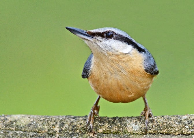
Nuthatch photographed at Lynford Arboretum Feeding Station on 15 April 2014

I chose to set up a feeding station and provide food for one species in particular, the nuthatch (see above). My aims for this work were as follows:

·         To gain experience and expertise in the two major genres of photography (natural history photography and documentary / reportage) that will be of most use for the successful completion of the major project.

·         To produce a series of attractive photographs of a charismatic, colourful and relatively confiding species of bird, that comes readily to feeders in the areas in which it occurs.

·         To produce portraits of the bird, featuring a range of expressions that bring out some of the character of this species.

·         To illustrate the bird feeding and/or taking food from the feeding station.

·         To practice and hone my skills for taking shots of wildlife action.

·         To gain experience of using two recent acquisitions, a Nikon 300mm F4 lens and a Nikon 1.4x converter, in combination with my Nikon D7000 camera: the lens combination had been acquired primarily for the purpose of taking wildlife action shots.

Preparatory Work
I chose to carry out the photography at Lynford Arboretum in Norfolk’s Thetford Forest. This attractive area hosts a wide variety of woodland birds, including uncommon species such as common crossbills and hawfinches. The area is frequented by birdwatchers, particularly during the winter months, and incorporates several “official” and “unofficial” feeding stations which are regularly stocked with food. As a consequence birds such as the nuthatch, which is a confiding species and is readily attracted to food, have become habituated and relatively fearless. Although feeding the birds is less common (or necessary) during the spring and summer, birds continue to check out feeding stations on their regular circuits through the woodland and will quickly discover free “caches” of food when they appear.

I chose to set up my feeding station on two parapets on opposite sides of a small bridge over a stream running from a nearby ornamental pond. The area attracts lots of birds (including crossbills, which come to drink in nearby pools) and food is left out on the parapets during the winter. I carried out two “practice runs”, on 10 April and 15 April 2014. A combination of peanuts (a nuthatch “favourite”), sunflower hearts and wild bird seed was used as “bait” and this attracted seven species of bird (nuthatch, marsh tit, blue tit, great tit, robin, dunnock and chaffinch) to the parapets. I stood roughly 4-6 metres from the bait. As well as taking photographs of birds on the parapets I produced images of them perched in the branches of surrounding trees and bushes, providing a more “natural” environment for the portraits. Common crossbills and grey wagtails were photographed in this manner, although neither species came (or would be expected to come) to the feeding station. On each occasion I spent 2-3 hours at the feeding station and I took around 500 photographs of birds in total. The following issues were highlighted:

·         The feeding station is surrounded by trees and bushes and stands in partial shade for most of the day. I therefore decided to use an ISO rating of 500 or more and to choose a bright day in order to freeze action with a fast shutter speed (1/500s or less) and avoid significant under-exposure.

·         I tried a number of ways of shielding the bird food from the camera whilst retaining full views of the birds, but none were successful: the birds were intent on feeding from the parapets only. I therefore had to include the nuts and seeds on many of the images taken at the feeding station.

·         Whilst the other birds (especially tits) were happy to perch on nearby trees and bushes before coming to the feeding station, nuthatches preferred a direct approach from distance, so I was unable to get any good images of nuthatches perched in a natural environment (e.g. on a tree trunk or branch).

·         Nevertheless, I was able to get a handful of decent photographs of nuthatches in a “classic” pose, with seeds or nuts in their mouths.

·         Using the 300mm lens with 1.4x converter and a relatively wide aperture (f/5.6 to f/7.1) allowed me, after some judicious pruning of nearby vegetation, to throw the background out of focus giving in many cases a pleasing “bokeh”. However, during the middle of the day when the light was brightest it was necessary to increase the shutter speed (I was shooting using shutter priority) because a large, nearby sign beyond one of the parapets became distracting at narrower apertures. Because I had opted to shoot in different directions to cover both parapets I did not want to shoot in aperture priority mode (the other background was much darker).

·         Despite the birds allowing me a close approach they still appeared fairly small in the frame. If I came closer than about 10 feet to the parapets the birds were too close to focus on, so I had to accept that some judicious cropping of the resultant images would be necessary in post-production.

·         I concentrated on focussing on the heads (specifically the eyes) of the birds. However, because I was using a high focal length lens combination with a generally wide aperture, I was unable to get the whole bird in focus unless it was standing “side on”. Of course the birds were moving rapidly, often walking or running towards or away from the camera and often turning or feeding. Their visits often only lasted one or two seconds, if that! As a consequence, the vast majority of images taken were flawed, many being blurred and/or out of focus. The very high failure rate is not unexpected under these circumstances.

Workflow
The assignment work was carried out on 21 April 2014. I arrived at the feeding station at 10.00am and photographed until 1.30pm, with a half hour break in the middle. During this period I took around 350 photographs of birds on the parapets of the feeding station and in the surrounding bushes. I photographed all the birds that came to the feeding station, but concentrated on nuthatches. The weather was bright, with hazy sunshine which was diffused by the surrounding vegetation, so I did not have to worry about unwanted shadows or too many bright highlights. The camera/lens combination worked well on the day. I shot Raw + highest quality jpeg, using ISO 500 throughout, with the shutter speed set to between 1/500s (mainly) and 1/800s. Under these conditions a tripod would have been of no use. The birds came to the feeding station regularly and I left knowing that I should have some decent images.

Post-production
I have a standard procedure for editing my images, which was followed as described below:

·         The images were viewed on the back of my camera. Those that were obviously flawed (blurring, out of focus, bird movement, bird gone etc.) were deleted, leaving me with 85 images.

·         The jpeg images were downloaded on to my computer and reviewed on the full screen. Those with significant flaws were deleted, together with others that did not add anything to my image portfolio. I was left with 32 jpeg images, of which 13 featured nuthatches. The raw files for these images were downloaded: the remaining raw images were deleted.

·         The 13 nuthatch jpeg images were edited, using “Photoshop Elements 8”. The images were cropped and minor adjustments were made to the histogram (“levels”), highlights, shadows, brightness and contrast, with a little sharpening being carried out where deemed advantageous.

·         These images were reviewed and six were selected that were deemed to represent aspects of the birds’ behaviour, or “decisive moments” that occurred during the course of the shoot.

·         The raw images for these six “decisive moments” were then cropped and edited using Nikon View NX2. The resultant images were converted to 8 bit Tiff files. Further minor adjustments were made to these files in “Photoshop Elements 8” and the files were then saved in both Tiff and jpeg formats to produce Images 1-6.

·         Two additional images, of a marsh tit and a robin, which were captured on the same shoot, were edited in the same manner as above to produce Image 7 and Image 8. These images, which are amongst my favourites from the shoot, illustrate that when photographing wildlife it is impossible to predict what is going to happen!

“The Decisive Moment”: Sequence of Images
The Images 1-6 are shown below, in the order in which they were taken, and with a few comments about each image. It should be stressed that, during the shoot, there were probably 200-300 “events”, where a bird came to the feeding station and left again. In many cases I was unable to record an event and I rarely managed to take more than one image of a particular event. Images 1 to 6 therefore represent decisive moments from four separate events that I managed to capture (images 4-6 came from the same event): hundreds of other potential “decisive moments” were missed and have been lost forever.

Image 1
ISO 500, 1/640s, f/6.3

The bird has a peanut in its mouth, producing a classic “nuthatch” pose. Because the bird is side-on to the camera it is in focus. The dark background has been thrown out of focus, although a little noise is evident, despite the medium ISO rating. The nuts and seeds on the table are thrown mainly out of focus: they relate to the bird’s situation, but could be regarded as being a little distracting. The image was cropped to “letterbox” shape to emphasise the bird’s posture. As I will show later, further cropping to produce a “head and shoulders” image of the bird leads to a much cleaner photograph, but this would be too small for printing at A4 size.

This image was included because it demonstrates a “decisive moment”, when the bird has picked up a peanut in its bill and is about to fly away with it. This is characteristic behaviour of this species, which I wanted to capture.

Image 2
ISO 500, 1/640s, f/8

Co-incidentally, the next photograph in the time sequence also features a nuthatch with a peanut in its mouth, although the nut is being held in a different manner. The bird is at an angle to the camera: most of the body is in focus, but the tail is out of focus. Most of the food is hidden from view, although another peanut can just be seen to the bottom right of the frame: I could have cloned this out, but decided that its presence would give a clue to where the nut had come from. The out of focus parapet in the background is a little distracting: with care, this could have been cloned out but I chose not to do this. The diagonals provided by the bird’s upper body and by the bill mandibles assist in the composition of the photograph, which is markedly different to that of Image 1. As with Image 1, further cropping to concentrate on the bird’s bill, head and upper body gives a cleaner picture, but again this would be too small for A4 printing.

This shows another decisive moment in the bird’s visit to the feeder. Here the bird has an upright posture.

Image 3

ISO 500, 1/640s, f/8

In this image I have captured a moment when the nuthatch has selected a food item and is picking it up in its bill: this is another “decisive moment” in the sequence that starts when the bird arrives at the feeder. The positioning of the bird means that its tail, rear end and far leg are out of focus, but the “business end” is in focus. The food in the background is a little distracting and, unlike in the other images, the bird’s posture means that its breast is not silhouetted against the background. Nevertheless, this image illustrates an important aspect of the bird’s behaviour that I wanted to capture.

This photograph illustrates the “split second” moment when the bird transfers food from the feeding station into its bill.

Image 4

ISO 500, 1/800s, f/6.3

Co-incidentally, Images 4-6 were taken over a period of a few seconds during a single visit to the bird feeder. Here the bird has just arrived and is looking round (as birds always do) for potential danger. It knows that I am a few feet away, pointing a large object in its direction, but it has visited many times before and is confident that I pose no significant threat. The posture is typical of this lively, perky bird and all the important features of the bird are in focus.

Perhaps this may not be described as a “decisive moment”, but this portrait shot reveals the character of the bird.

Image 5

ISO 500, 1/800s, f/6.3

Following its arrival (Image 4), this bird has hopped forward a few paces and is about to pick up a nut. The bird is still wary. On this feeding station the nuts are hidden from view. The rear edge of the parapet (on which the bird was standing for Image 4) is now a background blur and, because the bird has turned half left, its tail and rear end are out of focus. I cropped up from the bottom of the image to remove some distracting, out of focus foreground.

This is another portrait shot of the bird as it stands poised, ready to grab some food and then fly away.

Image 6

ISO 500, 1/800s, f/6.3

The nuthatch (Images 4 and 5) has made its decision and picked up part of a nut, which it is holding in its bill. It will shortly fly away. Close inspection of the upper mandible reveals a couple of fragments of food that have adhered to the bill whilst it was choosing the nut. In other respects, the pose is similar to that seen in Image 5. During the course of my work at the feeding station I noted that nuthatches often eat smaller food items there, before flying away with larger items to consume in safety, high in the surrounding trees.
This is another “decisive moment”: the bird has selected a food item and is ready to fly away with it.

Ranking of Images
In selecting Images 1-6 from the 350 that I took on the shoot I have, whilst trying to show “decisive moments”, also tried to pick images that illustrate a typical visit to the feeding station, from the moment when the bird arrives to the moment that it leaves (I was unable to capture any meaningful images of the nuthatches in flight). This sequence would follow the order:

Image 4 -> Image 5 -> Image 3 -> Image 1 -> Images 2 and 6.

I find it difficult to rank images in order of preference. Does a flawed image of a bird with a nut in its mouth rate above a better, but straightforward portrait image? I have had a go: here is my ranking order.

Favourite: Image 4
Yes, this is a straightforward portrait shot, but the pose of the bird sums up for me the character of the nuthatch. Most of the frame is in focus, with the exception of the background, which is both pleasing to me and suggestive of the bird’s natural environment.

Second Favourite: Image 6
Ideally the bird would have had a peanut in its bill, but nevertheless I like the bird’s pose, the glint in its eye, the uniform background and the fact that a “decisive moment” has been captured.

Third Favourite: Image 2
I wanted to capture photographs of nuthatches with peanuts in their bills (another “decisive moment”) and this is perhaps the best example that I captured on the day. All but one other food item is hidden from view, which makes the image “cleaner”. However, a higher proportion of the bird is out of focus than in Image 6 and also the separation of the bird from its background is less well defined.

Fourth Favourite: Image 1
Here the whole of the bird is in focus, due to the “side on” view, and it holds a peanut in its bill. However, the bird’s head is turned very slightly away from the camera, the background is not as clean and the out of focus bird food is somewhat distracting.

Fifth Favourite: Image 3
A different “decisive moment” in the bird’s behaviour is shown, and it forms an important part of the story. However, the distraction of the out of focus seeds in the lower background, the rather dark upper background and the out of focus rump and tail of the bird are photographic flaws.

Sixth Favourite: Image 5
I have placed this image last because it represents a fairly standard nuthatch portrait. The bird doesn’t have anything in its bill and as a “standalone” image it doesn’t have any special features that would raise the level of interest. I prefer several of the photos of other birds taken during the shoot to this one.

Further Editing
I have commented on distracting backgrounds that are present in some of Images 1-6. Although the original photographs have all been cropped to produce images that would be suitable for printing at A4 size, further cropping can produce images that, whilst consisting of fewer pixels, might be suitable for magazine articles or internet features, whilst in many cases removing the sources of distraction. I have cropped all the images further and the smaller images, placed in sequence to mimic a typical visit to the feeding station, are attached below.

Image 4a

Image 5a

Image 3a

Image 1a

Image 2a

Image 6a

These cropped images reveal the character of the bird, in (with the exception of the first photograph) a series of “head and shoulder” images, although they are too small for a large print.

Other Birds Using the Feeding Station
I took photographs of all six species of bird that used the feeding station during the shoot. I have selected two of my favourites which, whilst not relevant to the original purpose of the project, were amongst my favourites of the day.

 Marsh Tit (Image 7)

Image 7

The marsh tit is an uncommon bird associated with areas of wet woodland. They come readily to bird feeders and feeding stations and Lynford is the best site that I know to both see and photograph them. This tit is quite a plain little bird, but it is feisty and, despite its small size, it is far bolder than the much more common blue tits and great tits that also use the feeding station. I think that Image 7 illustrates the bird’s character quite well and, despite the (typically) untidy appearance of the bird, this is my favourite image of the whole shoot.

Robin (Image 8)

Image 8

I also like this lively portrait of a robin. The untidy feathering and somewhat unusual posture add to its appeal, whilst the all over sharpness of the image and pleasing background add to its strength.

These two images, which were processed in the same manner as Images 1-6, are included as jpeg and tiff files with the other assignment images.

Conclusions
Photographing very active wild birds feeding at close quarters is an exciting and enjoyable, but very challenging experience for the wildlife photographer. Even professional photographers may spend many hours or even days to get perhaps one or two publishable photographs or a single planned sequence of images of a particular subject.

A further refinement to the work that I have described above would have been to provide a natural looking feeding station, such as a wooden log, and hidden the bird food from view in order to provide totally natural images of birds such as the nuthatch and marsh tit: this type of feeding station is commonly used by professional photographers. This would have been a “high risk, high reward” strategy, as the birds may have taken weeks to find and become accustomed to the new environment. I also wanted, for this project, to emphasise the fact that the birds were being photographed at a feeding station. However, I do intend to investigate the strategy in my own garden, for potential use in the major project and beyond. I could also, of course, have used “Photoshop” to replace the parapet surface with a more natural looking (e.g. wooden) foreground. However, this would have been both difficult to do and ethically unsound.

I believe that the considerable amount of practical work that went into the project will, in the long term, improve the standard of my wildlife action and documentary photography. I also hope that the Images 1-6 will provide the viewer with some feeling for the character of the chosen bird species, the lively nuthatch, and give them an insight into one example of how providing wild birds with food is beneficial for both the birds and for ourselves.